

project overview
About the project
In this project, Laerdal has asked us to redesign the CPR training product for inspiration to improve its usability.
Focusing on people who do not have previous CPR knowledge and enhancing their learning experience, a service design with the new App and the virtual practice system has been delivered.
Design Process

discover
Context, User, and Product
To gain a deeper understanding of the product's background, a systematic analysis of the company and market positioning was conducted. The intended use scenarios, user groups, and product build-up (ecosystem, physical, and digital) have been defined.

Functions and Interaction
What are the product's functions? How do users interact with the product?
The functions and intended interactions of the manikin and the QCPR App have been illustrated.

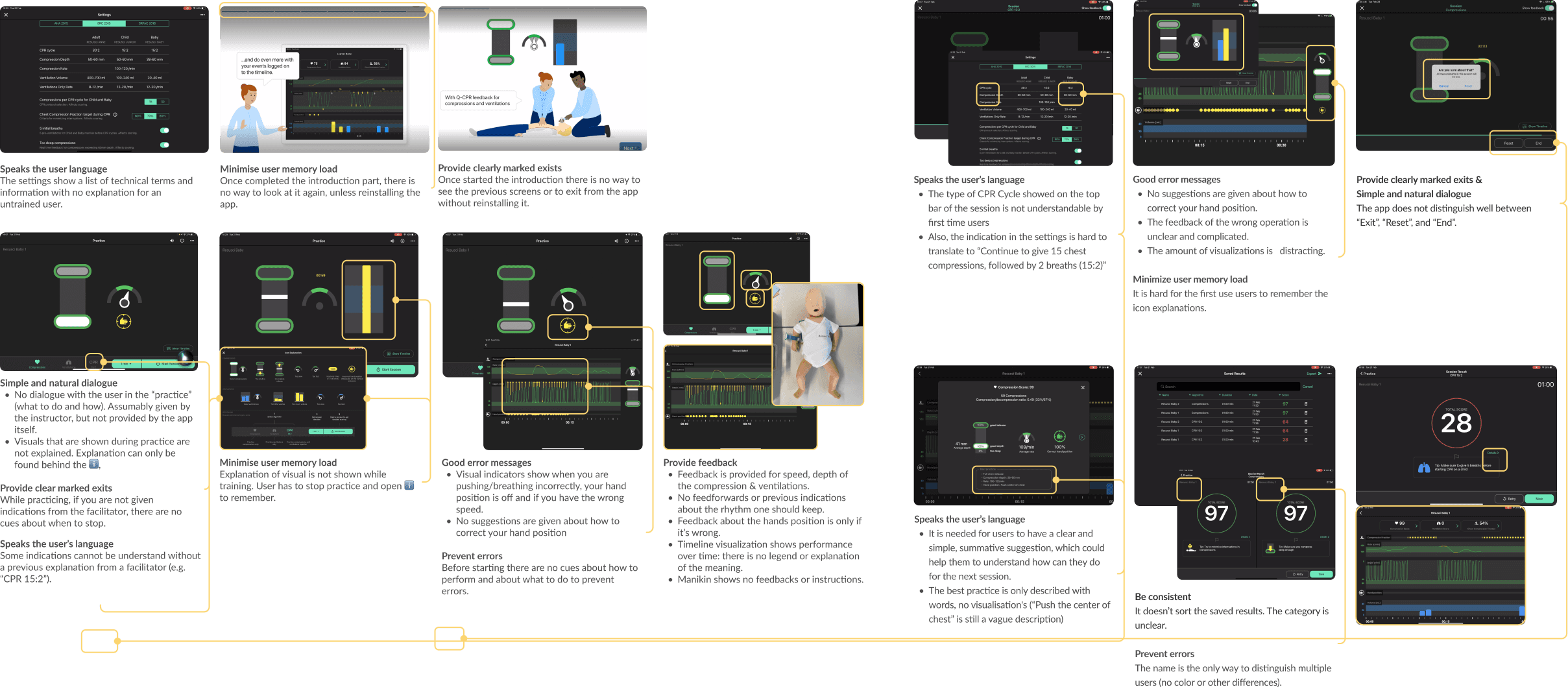
Heuristic Evaluation
In the pursuit of identifying usability issues, a heuristic evaluation was conducted to systematically scan for usage problems.
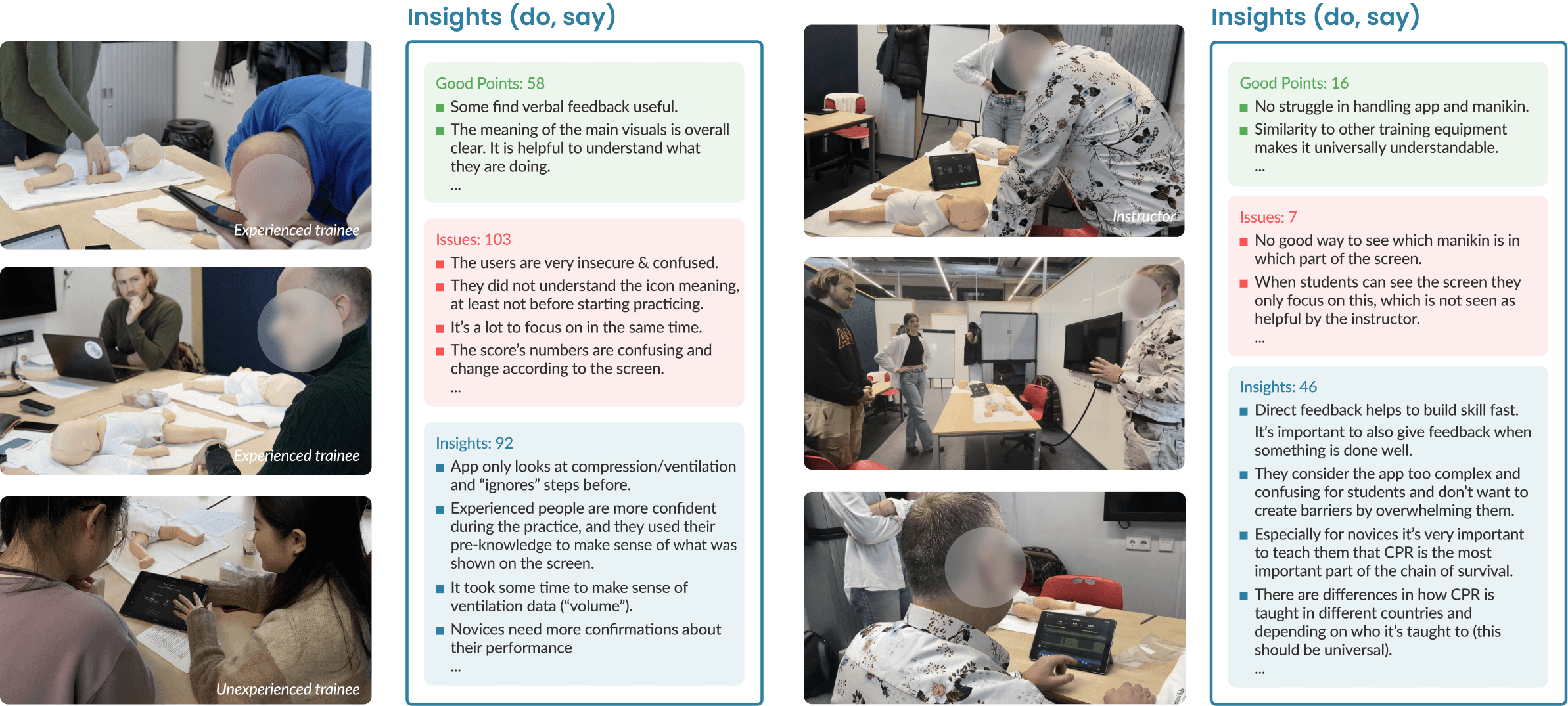
Usability test
A contextual user testing with 7 users has been conducted to collect realistic usage insights from what users did and said. The insights from three user groups (trainers, experts, and novice users) have been categorized into strengths, problems, and other insights. This section revealed that novice users face more difficulties and have a lower user experience during use.
Define
Problem Statements
Based on systematical research in the discover stage, 3 core problems have been summarized.
Unfriendly Learning Experience
Novice users feel stress and unconfident in skills during practice.
Complicated Information
Low accessibility to practice outside of the formal training environment.
Design Goal
“We want to make people without any pre-knowledge of CPR
to learn and practice their skills in a positive and reassuring way
without the need to visit a class.”
Design Vision & Qualities
The interaction with the design should feel like
riding a bike with training wheels.

The 6 design qualities
easy
accessible
guided
motivating
positive
purposeful
Develop
Conceptualization
Before starting brainstorming, the decision related to the product was already made. The new product will developed in two parts: the service and the application.
An Accessible Service
Without language, money, or time constraints
Service
Product for Newbies
Positive and motivating learning experience to release burden.
Application
Speak User language
Readable and clear guidance that understandable for new users
Application
Conceptualization
To achieve the design goals, multiple concepts were created during the brainstorming stage. These were eventually categorized into 3 concepts based on 'interaction personality'.

The mentor:
Step-by-step teaching and a mix of auditory and visual feedback.
The companion:
Free to choose what you want to learn, just visual feedback.
The coach:
Learn all at once, mainly through auditory feedback.
Lo-Fi Prototyping & Test
To make the best decision, the loft-prototyping of 3 concepts have been built and tested.

Decision
The outcome of the evaluation shows that Mentor is performing the best, and some interactions from other concepts also fits our design guidelines really well. The decision is to integrate the best features for the final redesign proposal.

Deliver
final Concept: A new Journey of learning
The compared journey maps of current and new product shows the user journey has been transformed from linear into circle. Different form the current scenario which just includes CPR training course, the redesign allows user to learn online, facilitating a process of repeated learning and practice.

The Service
The service as a connecting part links the online learning and onsite practice. it also supports the accessibility and friendly training environment for novice users, enabling them to learn and practice with less barriers.

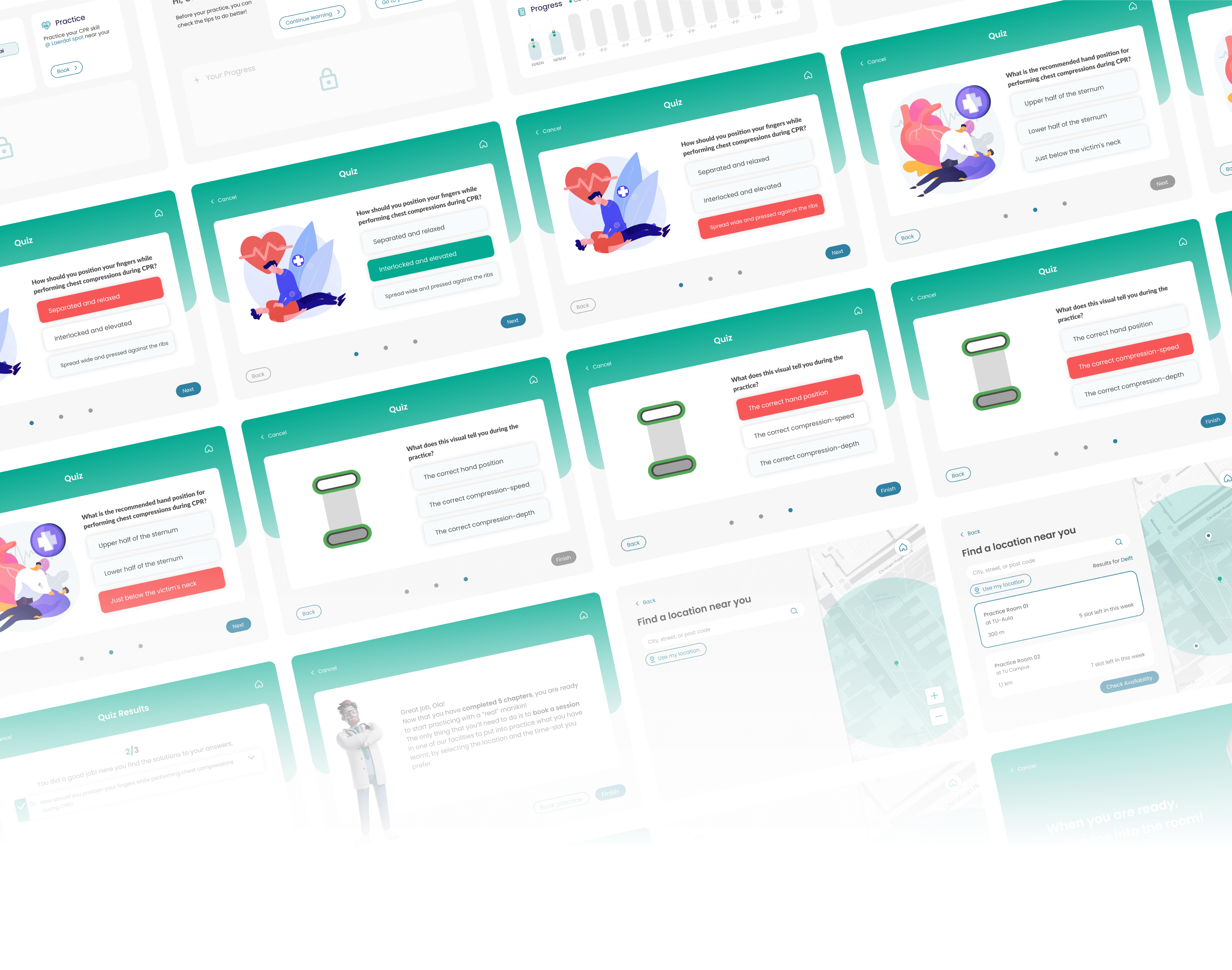
The new QCPR App
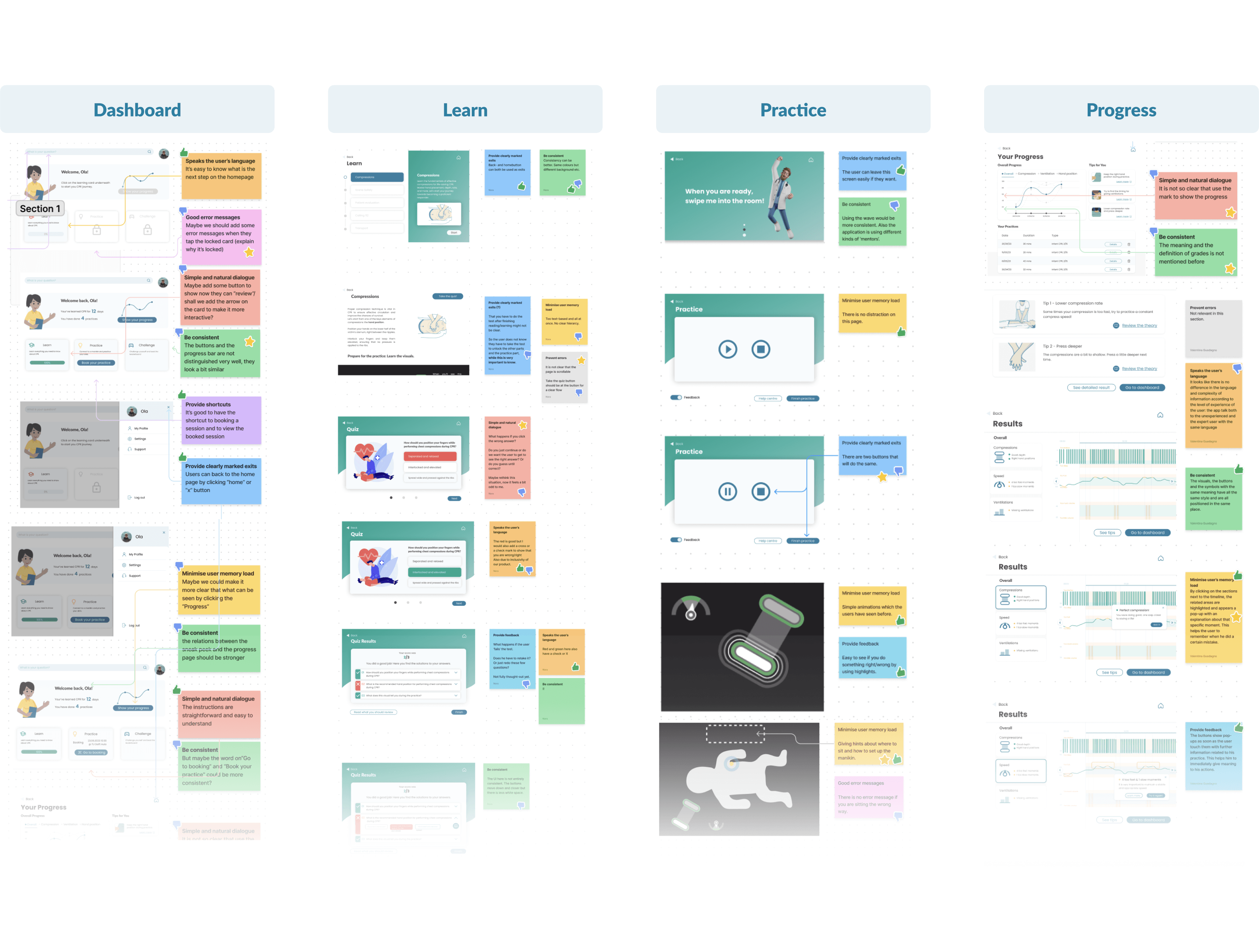
The information architecture visualizes how the structure and functions of the new App should be, which include the dashboard, Learn, Practice, and Progress for parts.

Final Design
With new design system, and interaction qualities, the structure has ben translated into the new QCPR Application.
Positive tonality for novice users

The new product embodies a positive and motivating attitude in its visual design and language.
Users can gain encouragement and support for learning or practicing CPR, which enhances their confidence.
Step-by-step learning process

The feature of progressive unlocking makes the learning process more intuitive, increases efficiency, and adds credibility to the content.
Accessible practice service
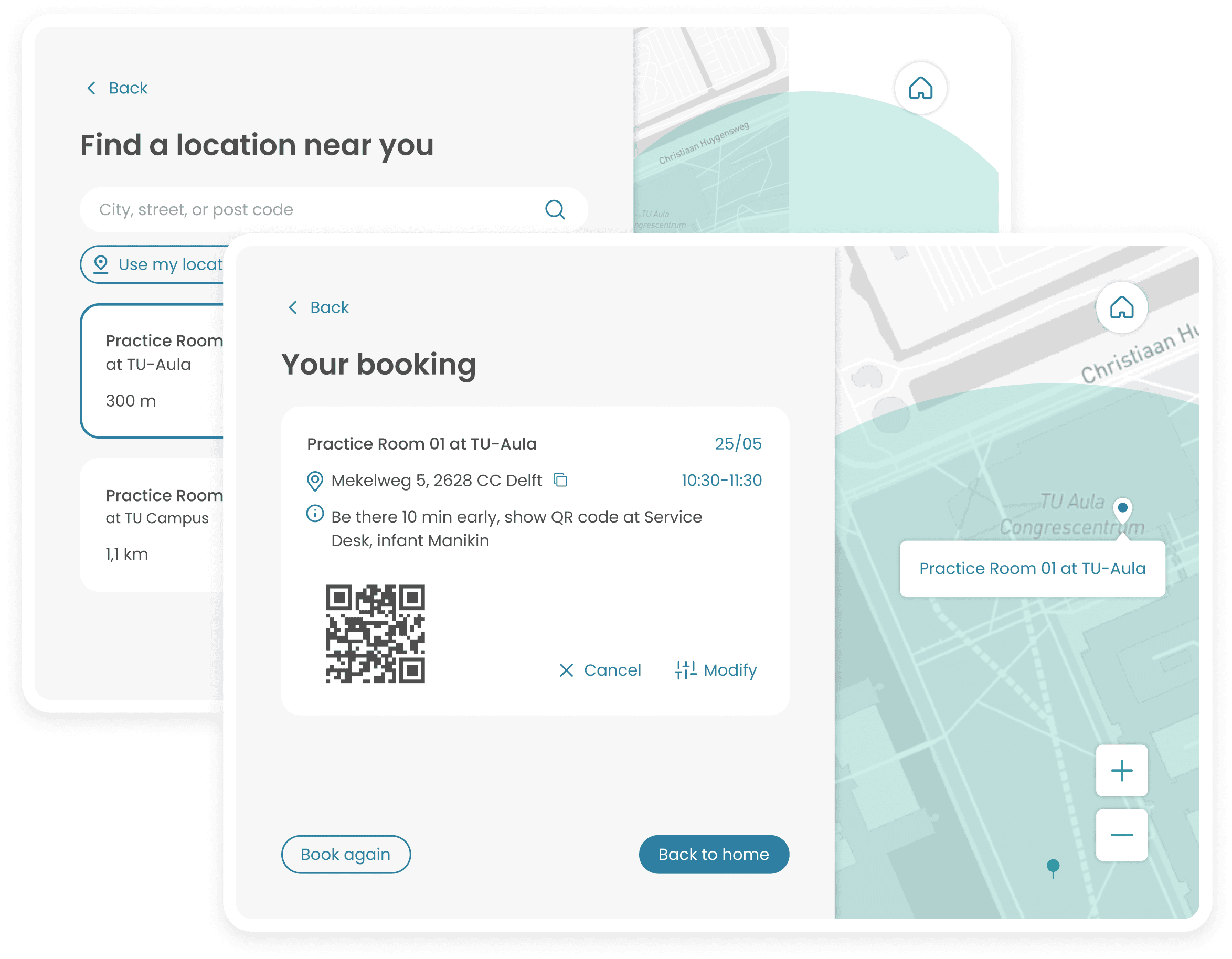
From home to the nearest Laerdal site, start practicing when you are ready.
By reducing barriers related to time and location, accessibility is significantly enhanced.
Mixed audio and visual feedback

The integration of AI and virtual technology provides users with more vivid feedback, making guidance more precise.
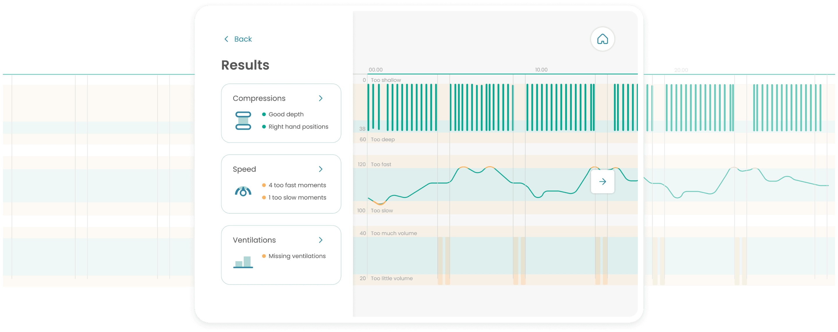
Simple and interactive results
Based on specific performance during practice, suggestions are provided from three dimensions of CPR, making the results more understandable and actionable
Evaluate
Did we meet the design goal? The evaluation will show the quality of the redesign, and present the direction of how the product can be iterated.
Heuristic Evaluation
A heuristic evaluation was conducted to inspect the usability of the interface, examining both the app’s screens and the manikin.
User testing
To determine the usability of the service and the application within the usage context, the final user testing has been conducted. During the test, the design goals were evaluated through specific tasks. Users' actions and feedback were also collected as important sources to identify issues with the product.

Results
Using the System Usability Scale (SUS), the new design achieved an average score of 84.4, indicating a generally successful outcome.

Additionally, the usability test included measurements of task completion times and error rates. The data indicate an overall improvement in usability, particularly in the immersive practice component.

During the tests, qualitative considerations were noted, including observations of participants' body language, behavior, and actions, along with their feedback and responses in the final mini-interview. These insights, combined with the heuristic evaluation, will guide further iterations of the design.
